In my two years of working at a framing studio, I worked with many different artworks, clients, and visual aesthetics. I also saw and experienced first-hand some of the mistakes and oversights clients made when they came into the studio. Thus, I have put together some best practice tips that will help even the most novice art collector better understand and communicate how to go about framing artworks when it comes to materials, conservation, and costs.
When you purchase a new, beloved, original artwork it is important to also consider the framing investment. Here, the word invest is intentional. Framing costs might seem high, but this added cost ensures the artwork is properly protected from environmental damages. Although premade frames are an option, they are limited to standardized sizes and do not provide adequate UV light or humidity protection long term.
The benefits of a custom frame are worth the cost. When working with a quality framing service, you receive excellent professional advice on the range of frame materials they carry, as well as quality craftsmanship. Studio Sixty Six works closely with the staff at Patrick Gordon Framing and we highly recommend their services for your next framing job.
Caps & Floats
To communicate your vision clearly to the framer, the first step is to know the anatomy of a frame. The frame, itself, is called a moulding. Mouldings come in two different styles - cap mouldings, and float mouldings. Cap mouldings have a lip, or cap to hold the artwork in place. A cap is the traditional format used for artworks on paper or fabric. The artwork is protected behind a pane of glass and then held in place with a window mat. Float mouldings are used for artworks on canvas or wooden panel. Float frames, like the name suggests, give the illusion of artwork floating within the frame. This style of moulding is not compatible with mats or glass.
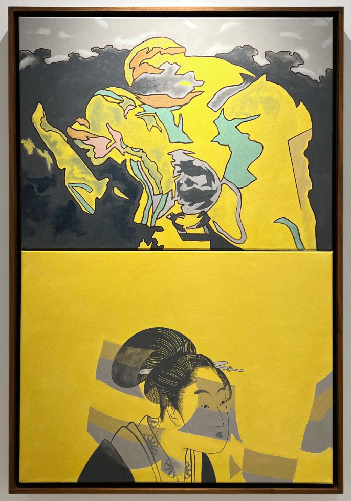
Here is an example of a float frame: Norman Takuechi’s Waiting. This artwork is custom framed using a solid walnut float frame. Notice how the warm walnut compliments the yellows without fighting for attention?
Matting Styles
Within the cap moulding family, there are a few different subsets for presentation. The most traditional style is a window mat that covers a fraction of the outer edge of the artwork on all sides. Apart from the clear focus this puts on the artwork’s image area, this style also serves a conservational function. The mat acts as a buffer to keep the artwork and glass from coming in contact with each other. As a rule, artwork and glass should never come in contact with each other. There is a likelihood that the materials will stick together and cause irreparable damage to the artwork.
Here is an example of a cap frame with a window mat: Andrew Morrow, Just Cooling Our Feet (Meagan). This artwork is framed with an 8 ply window mat and charcoal gray moulding. While this painting is quite small in scale, the wide mat gives the image room to breathe and emphasizes the subject’s mood.

Shadow boxes are a good choice when your artwork has some texture, relief, or you would like to include the edges of the paper in the presentation. To achieve this aesthetic, the framer will attach concealed paper hinges to the back of the artwork so that it appears as if the artwork is floating on top of the mat, rather than being held in by it. To ensure the artwork and glass are not touching, strips of matboard are inserted inside the frame’s lip to hold the glass away from the artwork. This technique creates visual depth and shadow play within the frame.
Here is an example of a cap frame with a shadow box: Christine Fitzgerald’s Elymes des Sables No. 2. Do you see how the decaled edges of the paper are visible? This presentation decision focuses your attention on the material quality of the print’s paper.

Colour Schemes
When making your presentation decisions, you will want to consider what materials and colours best compliment and do not compete for attention or over-power the artwork. A useful approach to this is to think of the mat and moulding as extensions of the artwork, rather than mere display containers. Neutral coloured mats like whites and creams are versatile choices that are successful in most applications. However, if you are interested in creating impact and personality, pick a recurring shade or tint present in the artwork as a starting point. Light coloured mats and mouldings give an impression of space for the artwork to breathe, while dark mats and mouldings activate the artwork as if it is jumping off the wall.
Your choice of moulding will greatly impact the mood and aesthetic of the room it is hung in. Take note of how you want the room to feel and of what the artwork itself evokes. White and black moudlings tend to feel modern and high contrast. For a softer vibe, try pale wood tones. A middle ground would be medium to dark neutral wood tones.

MaryAnn Camps, works from her series Passages. The white float moudling with the white border of the artworks creates breathing room between the images and balances the blue of the painted wall.
Ornate and decorative mouldings are another great way to create impact and evoke personality. Though, they can sometimes be TOO bold or flashy. If you are unsure your framing choice is too heavy, adjust to a lighter colour, or thinner moulding width. It is always helpful to ask for the framer’s opinion on this too. They are well-equipped to make recommendations based on the piece, where you will be hanging it, and able to match the aesthetic you are looking for.

Here is an example of an ornate gold frame: Leslie Hossack, Vilhelm Hammershøi, Intérieur. Strandgade 30 (1901). Collection of Städel Museum. This framing strategy compliments the art historical period of the original image and amplifies the nostalgic quality.
Glass
Although it may seem transparent, your choice of glass makes a crucial difference in the overall appearance of the artwork and its longevity. There are 3 main areas to consider when picking glass: clarity, conservation quality, and weight. I recommend never compromising on the conservation quality of the glass when you are spending the time to frame original artwork.
If you decide to use non-conservation, ordinary glass, the artwork is going to fade, deteriorate, and the glass will probably have quite a bit of glare. Museum glass on the other hand, although expensive, is unparalleled when it comes to showcasing the artwork’s best attributes. It has minimal-to-no glare, protects the artwork from a wide range of UV rays, and makes dark and/or detailed areas in the artworks more visible. If the artwork is large scale or very heavy, plexiglass may be a better choice for you. Good quality plexiglass is more expensive than glass, but its light weight means your large artwork will be more structurally sound long term and will be easier to mount on a wall. Plexiglass is a wonderful alternative so long as it is still conservation quality!
Ask the Experts
At Studio Sixty Six, we love helping our clients select framing for their artworks. For us, framing is one of the most personable parts of our job! Framing is where we really get to know your aesthetic and style. Here are some examples of Guilllermo Trejo monoprints we framed on behalf of a client. We picked three different moulding and matting options for the client to pick between.

For the first option, we chose a simple white moulding with a bright white mat. When this combination is hung on a light coloured wall, all of white tints visually blend together to let the artwork really pop! For the second option, we selected a muted maple wood moudling to ground the artwork. The soft wood tones give a more earthy, warm vibe, rather than the stark white on white.

And for the final option, we picked a geometric black frame with a matching black mat. This pairing gives the work a modern, edgy feel. Which option would you choose? The client selected option three, to fit his home’s modern, sleek aesthetic.